This is going to be the analysis of the City of Arts and Sciences in terms of composition, that is, we are centring our attention on shapes, patterns… more than in an explanation of the buildings or the architect which I’ve already analyse them in previous posts. (PA.2 and PA.3)
Even though, I found interesting the opening data, as it wasn’t opened all together at the same time but in periods of two to four years, that is, first building (hemispheric) was opened in 1998 and last building (agora), in contrast, was opened in 2009. And of course, as we already know this project was mostly in charge of the architect Santiago Calatrava, who we deeply research in (PA.2)
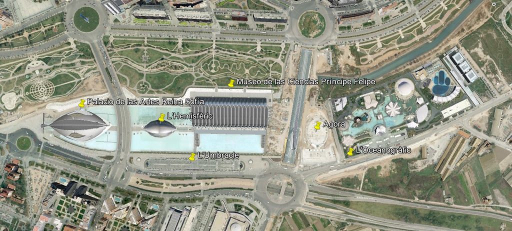
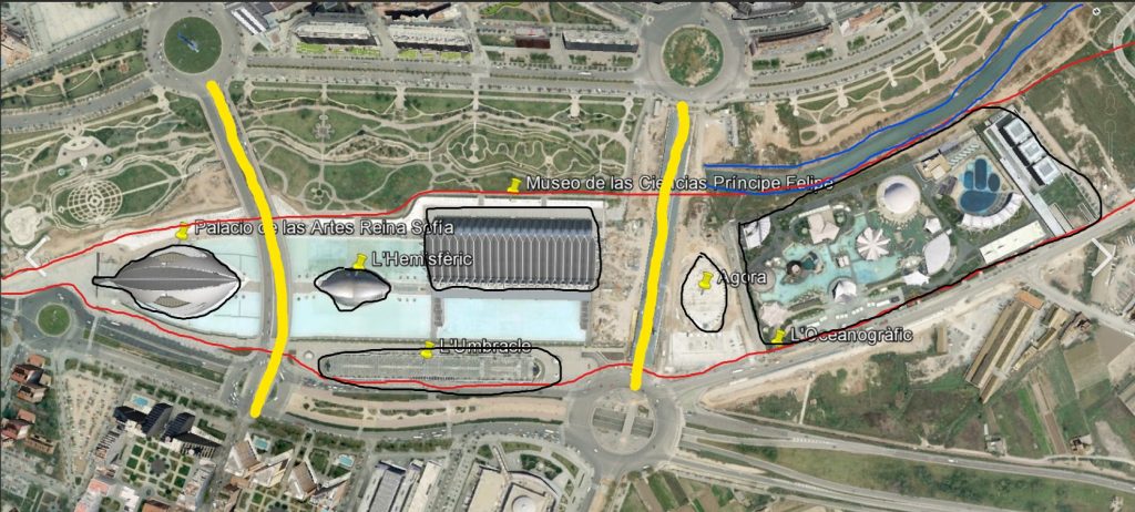
So, first thing we can observe is the plan of the CAS (City of Arts and Sciences) where at first glance we can discover that every building forming part of it is situated in a kind of axis that goes all along the previous bed of the river, which somewhen was remodelled to leave this space usable. As we can see on the second picture where a brief analysis has taken place, in between blue lines we can see the new bed of the Turia’s river whereas the red line hold the old bed which now a days is containing CAS.
Moreover, if we focus our attention a little bit more, we can realize that the buildings are under ground level as there are two bridges crossing the old bed of Turia, in this case remarked in yellow in the picture.
And eventually, we can distinguish every building at first sight, even though they are marked with black lines and a yellow tack to highlight and clarify.
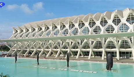
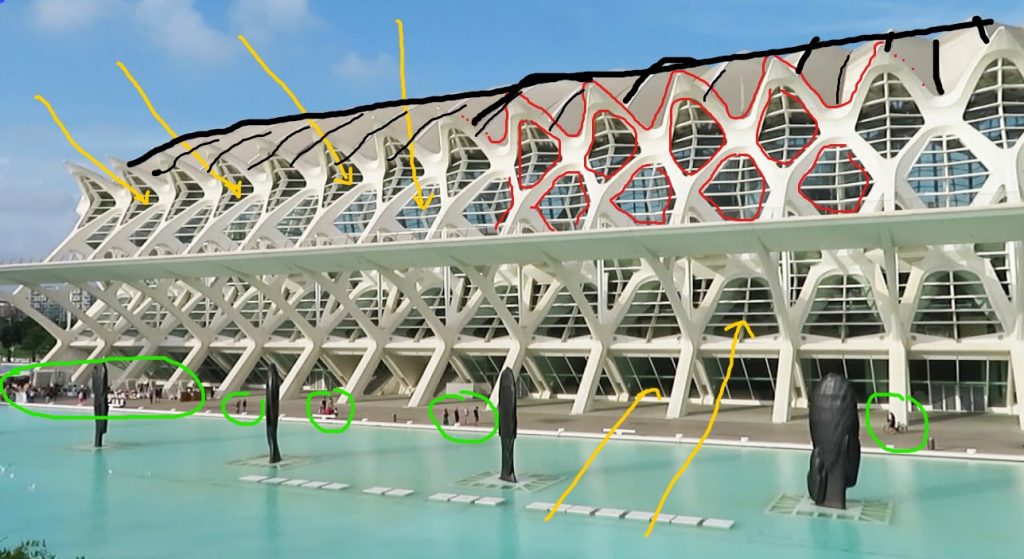
Moving now more into detail of the different buildings, we can observe some aspects related to composition on them. Firstly, in the museum façade there are some strange shapes creating a kind of protection to the glass backwards.
So, in this structure we can appreciate the rhythm of the construction represented in red in the second image; a consecutive opening shape is repeated all along the side exterior providing the building with dynamism and rhythm. Then, we can focus on light and the way it enters to the building following those imaginary yellow arrows drown on the picture below; the interior part is full of natural light due to the glassed side façades. After it, we can check the building’s scale in comparison to the humans in the surrounding. People is circled with green line, so we realize the building is much bigger than a human. Finally black lines try to reflect the movement of the building provided with those kinds of curvilinear vaults at the top giving once again dynamism and the feeling of movement.
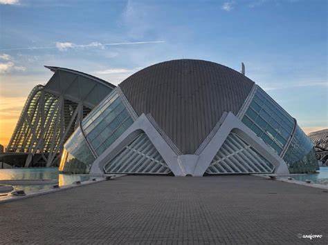
Finally, in this building that appear in Tomorrowland’s film we can appreciate in yellow once again the light passing through the glass providing interior with natural high-quality light. It is also visible the axis of symmetry in black dashed line in the second picture, that means both sides of the building have equal measurements and look like the same (they are the same at all). For sure, in blue, we can distinguish limits between what is ground and water. So, this kind of bricks path that give us the chance to enclose to the building are also performing as a barrier to water, containing it on the lower part of it. Furthermore, if we check any of the two images below, we will clearly observe texture generated by materials used on the façades of the building. A kind of bricks texture is given by the ground entrance and the top ceiling of the vaulted building, so we can also talk about unity here as it is all related one another. Then, and also looking at textures, the glass here is generating kind of a reflex of the sun bright at the façade which also gives the building a beautiful appearance; and of course, generating shadows which make us understand better the building at first sight. Eventually on this analysis we can center our attention in the proportions highlighted in red line; those king of triangled shapes and the building acting like a semicircle are examples visibles at first glance of how proportions work in this project.

So, this will be the analysis made of some of the buildings of the City of Arts and Sciences as most of them present the same characteristics or physics, even though their diversity when talking about shapes, meaning that those will be the most relevant aspects of the composition.
For more info, click here and check this interesting video of the principles of architecture and design.
